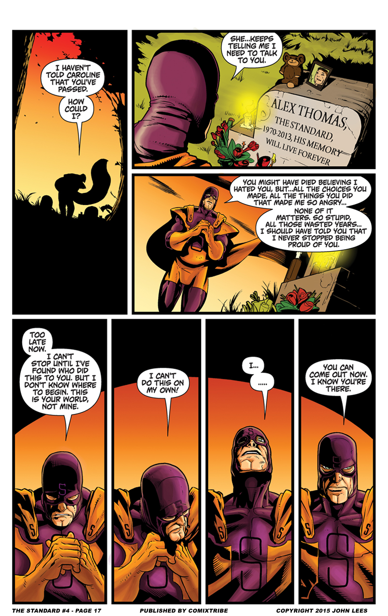
The Standard #4 – Page 17
I think it was around this part of issue #4 that colorist Mike Gagnon and artist Jonathan Rector really started clicking. Of course, Mike Gagnon had already done plenty of great coloring in Chapter 3 and earlier in Chapter 4, but it was around this sequence – probably also counting the previous scene – where it seems Mike really got into a groove and in lockstep with Jon’s art to the point where they were really bringing out the best in one another, complimenting and enhancing one another perfectly.
It’s not said often enough, but in a lot of ways getting the right artist/colorist pairing is just as important as the right writer/artist pairing. When that pairing is working right, a colorist isn’t just a hired hand to slap some tones on top of your artist’s visuals, but rather they are a creative collaborator in their own right, bringing their own contributions to the aesthetic of the book, their creative voice feeding into and off of the artist’s. It’s the art and colors in unison that serve to create the visuals of your comic. It’s something I’ve grown more appreciative of lately. I love Nick Dragotta’s art on EAST OF WEST, but I really love the visuals of Nick Dragotta and Frank Martin. I’m continually blown away by Chris Samnee’s art on DAREDEVIL, but it’s the visuals of Chris Samnee and Matthew Wilson that make it so memorable. Chris Burnham is doing some of the best art of his career in NAMELESS, but when praising the visuals of that book we ought to be praising Chris Burnham and Nathan Fairbairn. And the list goes on. And so I want to take a moment to show my appreciation for the great visual teams on the books I’ve worked on. Alex Cormack and Jules Rivera on OXYMORON: THE LOVELIEST NIGHTMARE. Iain Laurie and Megan Wilson on AND THEN EMILY WAS GONE. And Jonathan Rector and Mike Gagnon on THE STANDARD.


Cliffhangers every time! (not that i mind just mean i have to check back every day)