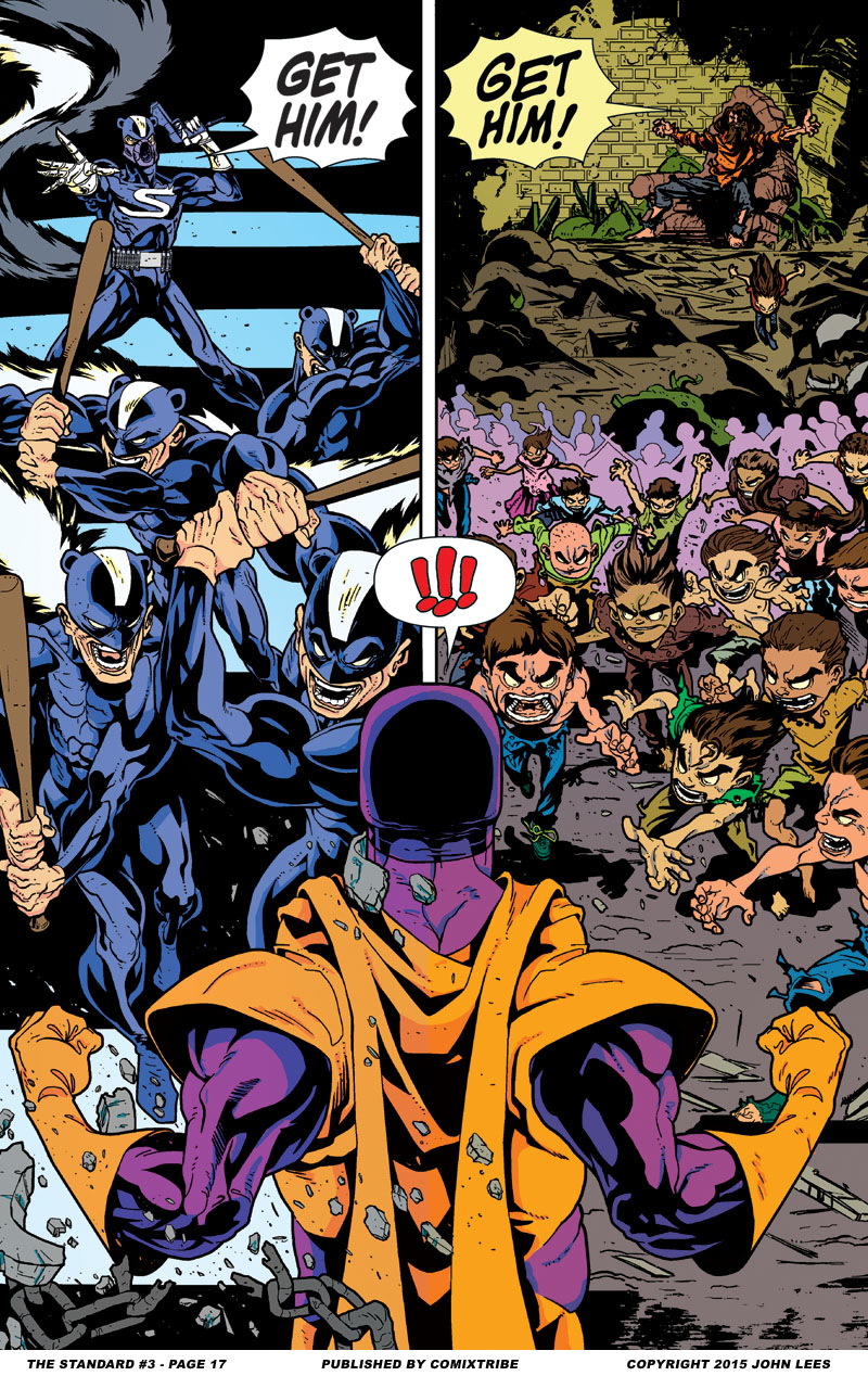
Here is a truly spectacular splash page by Jonathan Rector. This is one of those pages where, if I’m pitching the book at a convention, I’ll open a copy of issue #3 to this page to show the person I’m talking to and help to hook them on buying the comic. Not only is it an absolutely beautiful page in its own right which demonstrates the professional quality of visuals on offer in THE STANDARD, but as an image in the context of the series it wonderfully encapsulates one of the core dynamics of the story, the idea of a more upbeat, classic-comics past clashing with a darker, more morally murky present.
It’s the little things that make this page for me. Like, Jonathan Rector could easily have just drawn one version of The Standard standing in the middle between these two images. But instead, there are subtle differences, like we can see The Standard has more of a gut on the present-day side of the frame. Similarly, colorist Mike Gagnon’s contribution to the page is substantial. Again, he could have just coloured The Standard with the same palette, but instead, he’s a slightly lighter tone on the past side of the frame, reflecting both his lighter surroundings in that location and the subtler brighter color palette Mike used for the flashbacks.
Remember, THE STANDARD comes to Kickstarter on Tuesday May 26th!


Discussion ¬